INDUSTRY:
UX DESIGN
DURATION:
1-WEEK SPRING
YEAR:
2025

Canvas Re-Design
about.
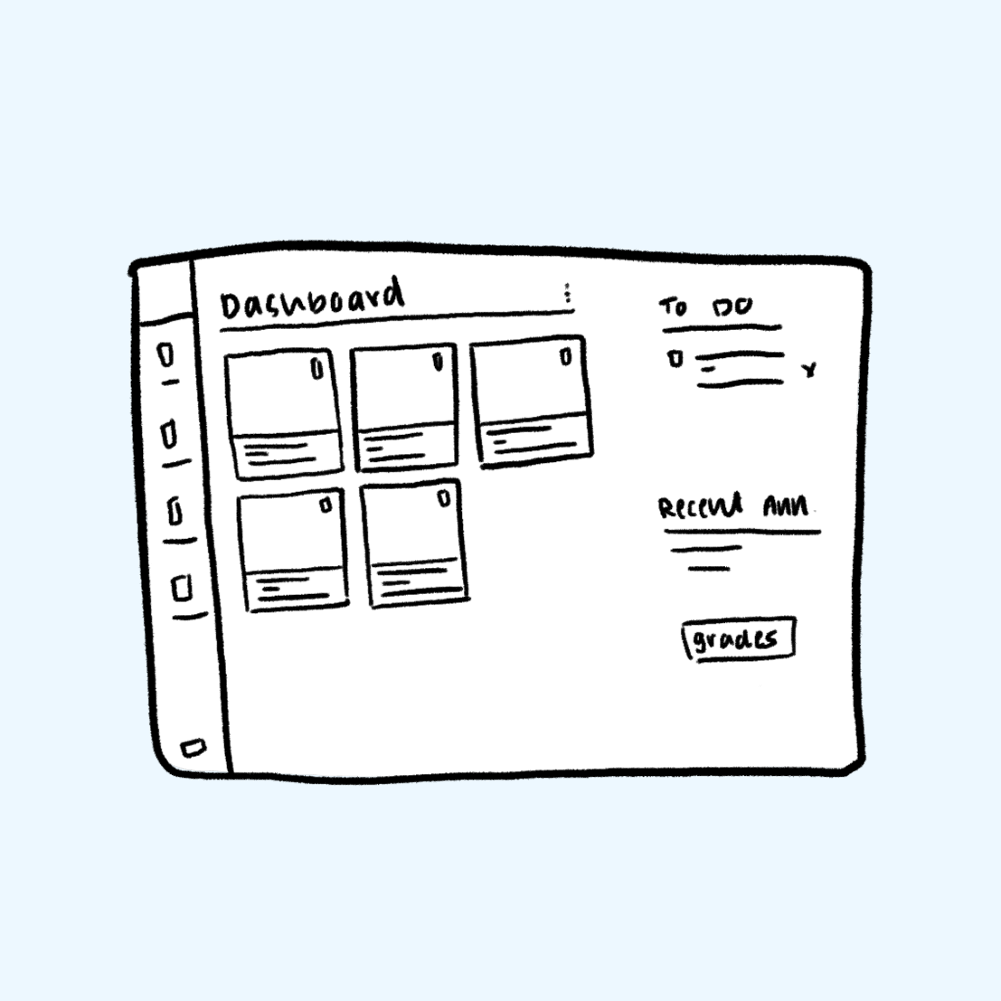
The Canvas LMS dashboard suffers from information overload, poor task prioritization, and inefficient navigation. Students often feel overwhelmed by an interface that lacks visual hierarchy, personalized insights, and meaningful organization. Usability issues, such as undifferentiated course cards, inconsistent To-Do lists, and buried feedback, undermine productivity and trust in the platform. User interviews confirmed a common theme: students want a dashboard that helps them work smarter, not harder.
challenge.
The redesign focused on four key goals: improving task prioritization, streamlining access to grades and assignments, enabling dashboard personalization, and adhering to the Canvas design system. Features like AI-generated task suggestions, categorized To-Do items, and enhanced course cards with metadata (e.g., due dates, unread messages) directly address the most common pain points. The result is a cleaner, more intuitive interface that adapts to individual learning needs and reduces unnecessary clicks.

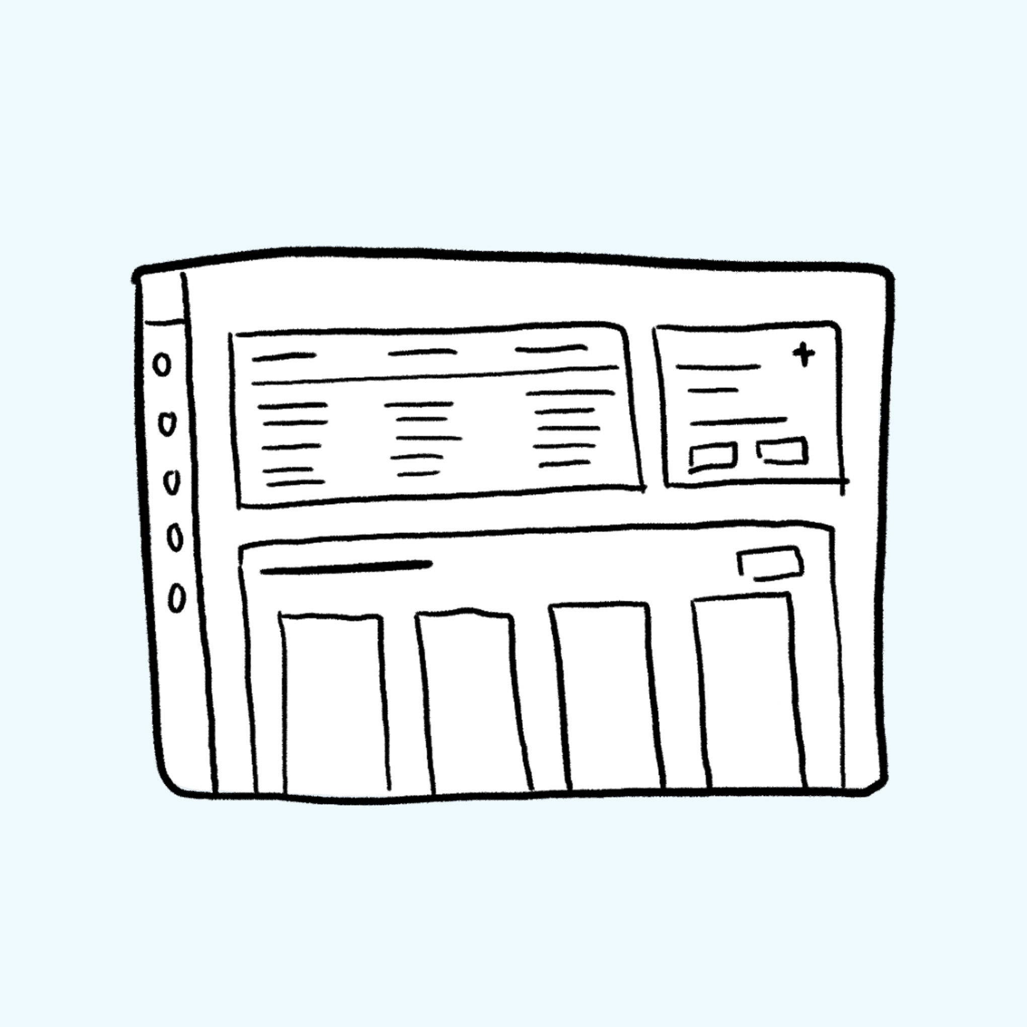

results.
The new dashboard design centers around an upgraded assignments section, enriched with progress tracking, filters, and inline previews. AI suggestions guide users toward high-priority tasks, while a visually organized To-Do list supports better planning. Announcements and feedback are surfaced in context, minimizing navigation loops. By prioritizing what matters most and making interactions more transparent, the redesign helps students and instructors focus on learning, not interface friction.